Project Overview
Designed around a real business goal.
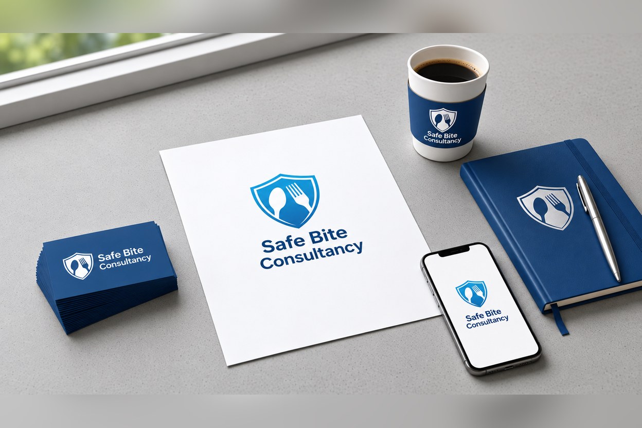
A trustworthy brand identity for Safe Bite Consultancy: a shield mark with a spoon and fork that signals food safety, in a confident blue palette, applied across business cards, letterhead, notebooks, cup sleeves and the mobile screen.
Our team brought strategy, design and execution together in one collaborative process. Every decision was tested against clarity, consistency and the action the client needed their audience to take.
Measured Outcome
One consistent look across print and digital touchpoints